

Selling a book is an art form in itself, and there are some quite important areas to factor in to not only help reach your target readers, but most importantly to increase your sales.
Brand Identity
Steve Forbes once said “brand identity is the most important investment you can make in your business.” As a professional in the visual design field myself, I can’t emphasize this enough. People in today’s society are educated buyers, and know what they want.
As an author, working to sell your book, you are a now a business owner, and should run your marketing campaign as such. The brand is essentially YOU. You are the brand, and it is important to present you in the best and most accurate way in the public media.
Selling your book will probably be the biggest challenge you are going to face, and it is important to recognize your strengths and weaknesses, and make good business decisions in order to reach your business goal.
In short you have to think like an advertising agency and become a sales person.
Selling a book is all about the packaging, delivery, and the value.
.1. The packaging
The packaging is essentially the cover design. It is the very first interaction your readers will have with your book. Think about all the products you use in your daily life. Ask your self, what was it about it, that grabbed your attention when you first saw it in the store? For me, before I purchase anything, I have to feel a connection with it. Something where I feel compelled to pick it up and study it closer.
I gravitate to products that represent quality, and it is the same with books. I will pick up a book with cover art that I instantly connect to. It may not be the book with the best story, but it really doesn’t matter, because I will first pick up a book based on the cover design. Each and every time. … Unless, a friend recommended a specific book to me, which I talk about in point 3 – The value.
Since the cover design (packaging) is a representation of your brand, it is important to make sure it is a TRUE representation of your:
- Story
- Genre
- And targets your audience, in the best quality possible. If the cover looks amateurish, the chances are, your readers will think this too.
.2. The Delivery
We just talked about the importance of your cover design. How to first grab the reader’s attention to pick up your book. Here is where the delivery of your book comes into play. The delivery has several components and are the following:
- The title
- Tagline
- Author name
- Review blurbs
- Awards
- Plot summary on the back
The title and tagline are equally important. The title is what the reader first reads, then they scan for a tagline. Look at the tagline as a way to entice your reader to flip the book over to read the plot summary on the back cover. Short titles are usually most effective, one or two words titles often have a grander impact then a sentence. I would focus on creating a catchy word to sum up your story, and draft a tagline that explores it further.
If you are an un-kown author waiting to be discovered, (no one knows who you are at this point) use the little space you have on your cover smartly. Don’t blow up your author name so that it competes with your title and tagline. In cover design, less is more. It is also very important to stay consistent with the typography of your author name throughout all your books. Myself, when I scan the myriad of rows with books looking for a specific author, whether it is at the library or at the store. I always scan for the familiar font style used for the author name.
If you have review quotes from persons in editorial positions, newspapers, magazines, something other than your best friend, use it. Not only does it help enhance the overall professional look of your cover, it also is something many readers look for. Think of this as a consumer review. If you have received an award as a writer, a recognizable and respected award, be sure to include it. When a reader see’s an award sticker on the front cover, it tells them that this is a book worth checking out. Sometimes it is better suitable to use text instead of a “sticker” logo format, have your cover designer help you make the right decision.

The plot summary on the back cover, is what I like to call the last effort to “seal the deal.” You have reached a great milestone by getting your potential reader to flip the book around. Everything you have presented so far, the reader likes. Now it is time to seal the deal, and it is your last chance to “pitch” your story. In the virtual book store world, readers will see the plot summary right below the title, be sure to write a description that will tease the reader, make them want to read more. Once the readers read the blurb on the back, if you have managed to captivate their attention, for most readers this is it, and they will purchase the book. Some readers however, will also open the book and read a few sentences to see if the writing style of the author is the kind they like reading. Chances are though, that if they have invested all this time, and are now looking inside the book. They will buy it.
Can you guess which bestsellers these blurbs are from?
Ancient secret brotherhood. A devastating new weapon of destruction.Robert Langdon embarks on a frantic hunt through sealed crypts, dangerous catacombs,deserted cathedrals and the most secretive vault.
At thirty-one, Noah Calhoun, back in coastal North Carolina after World War II, is haunted by images of the girl he lost more than a decade earlier. At twenty-nine, socialite Allie Nelson is about to marry a wealthy lawyer, but she cannot stop thinking about the boy who long ago stole her heart. Thus begins the story of a love so enduring and deep it can turn tragedy into triumph, and may even have the power to create a miracle…
The best blurbs are usually short, concise, to the point, and play on emotion. As a reader, I know the kind of stories I enjoy reading, and want to know right off the bat what the story is about. Whether it is a happy and a feel good story, a sad romance, or perhaps a political thriller with historical fiction, I want to know before I begin reading it.
.3. The value
The value is what you receive from reader’s personal reading experience. If they like the book, they will most likely mention it in passing to other book lovers. If they love the book, not only will they mention your book to others, but they will go the extra mile and write online reviews. If they are a member of a book club, it will surely be a topic of discussion. Readers who also found a story that they connected with, will often purchase more copies and give to friends as birthday gifts. I am that reader, and when I love a story, I mean, really love it, I will give copies to my fellow book lovers as gifts. Book lovers, are always looking for that great next book to read and we don’t want to waste our time reading something that feels like a waste of time. I do also want to add, when I get a book recommendation from a friend, the importance of the cover design, usually becomes insignificant. I have purchased books where the cover was simply non appealing to me, and had it not been for my friend’s high praises, I would never have picked it up. … It goes to show, the value a book recommendation, really has.
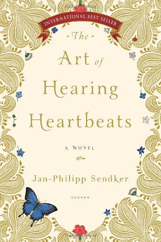
The Art of Hearing Hearbeats by Jan-Philipp Sendker, is truly a book worth recommending. Such a beautiful and memorable story, and I can’t tell you how many copies I have purchased of it and given to friends for their birthdays. Every friend I gave this book to, or recommended it to, came back and thanked me, because they too, loved it. I don’t particularly think the cover design is a good representation of the story, and is definitely not something that would grab my attention. In all honesty, I simply hesitated when I arrived at the shelf it was sitting on. First I had to look very closely to make sure it was the right book, but also I simply didn’t have a connection to the design. I understand and fully agree with that to some, this could be a beautiful cover. It just goes to show that art is not a science but in fact quite subjective. There is no right or wrongs when it comes to art, but the one thing this cover did represent to me was, quality. The professional look and feel, told me that this author takes his platform seriously, and it helped me decide whether or not to purchase the book. I can’t tell you how very fortunate I feel, for having read this beautiful story.
I know there are so many more wonderful books out there, waiting to be read, and to be shared. Don’t skimp on the very thing that will grab your reader’s attention, but remember to recognize your strengths and weaknesses …
—Anita
Feel free to contact Anita directly at: anita@race-point.com for any graphic design related needs.
Learn more about Anita

Anita B. Carroll is a visual design consultant and owner of Race-Point.com, supporting self-published authors and publishing houses with all their business brand identity design needs, and offers a FRESH take on book cover design. Anita has over 17 years of experience within the visual design field, starting out managing creative initiatives for both online and print publications, for Fortune 500 Businesses in Silicon Valley, California. Experience applying brand visual design and content guidelines consistently across several products. Anita is specialized in Heuristic Evaluation, Web User Interface Design with focus on online usability testing, a valuable skill when designing book covers for the rapidly growing digital market. Anita is also an avid reader. Discovering book cover design has provided the opportunity to combine her works in photography and graphic design skills.
Anita’s work has been featured in the KOBO Writing Life, Anneli’s Place, Monadnock Living Magazine, Amherst Citizen, The Milford Cabinet, and The Union Leader.
Over the past 17 years, Anita has gained experience in both the United States and Norway, and is currently working out of her home studio in New England—US, where she works with clients from around the world.
Anita is also an avid photographer and a Lampwork Glass Artist, and her works have been displayed at various galleries throughout the years.
In her free time, she enjoys traveling and exploring what Mother Nature has to offer with her family. … You might spot her at one of the U. S. Cape beaches, biking the National Sea Shore trails, photographing the gorgeous coastline, as well as capturing beautiful moments through beach portrait photography.

~*~
To connect with Anita you can easily connect with her on Facebook (http://www.facebook.com/RacePointUS) and Twitter (@RacePointUS).
Anita enjoys connecting with self-published authors of any genre, so please feel free to contact her directly at: anita@race-point.com with any cover design questions and needs.

Great, practical advice. I think it’s tempting as a newbie to self-publishing to underestimate the impact of a powerful cover. But you’re right, whenever I look for a book, whether it makes sense or not, the cover is the first point in the process of elimination.
It definitely is, and of all the areas to skimp on, the cover design should not be one of them which brings up another good topic – the cost of cover design. Getting a cover designed by a professional doesn’t mean that it has to break the bank. I was a guest blogger a few weeks ago where I touch upon this:
http://annelisplace.wordpress.com/2013/10/11/confessions-of-a-graphic-designer/
Thanks! —Anita 🙂